Ministry logo

Ministry logo
Showing posts with label design. Show all posts

Wednesday, 13 June 2018

The Battlefield of Exhibition Design


There’s a battle going on behind the scenes of museums and its taking place in project meetings across the world. Collections staff are having to harness their collection management toolkits, arm themselves with knowledge of off-gassing, lux levels and accurate RH and temperature readings. All in the good name of best practice in collections management.

The Times recently published ‘Amanda Levete begs V&A’s curators to see the light and feel the drama’ and it documents an all too familiar battle that collections management face with architects, designers and any creative minds who do not appreciate the duty of care museums need to take to preserve collections for future generations.

The Times article outlines the development of the  ‘occulus’ in the redeveloped courtyard of the V&A – a skylight that would ‘bring light to the historic collections’ (nah mate)  and allow the public to view into the galleries below - if curators weren’t such cowards apparently. For any collections staff it’s an infuriating read that of course sympathises with Levette.
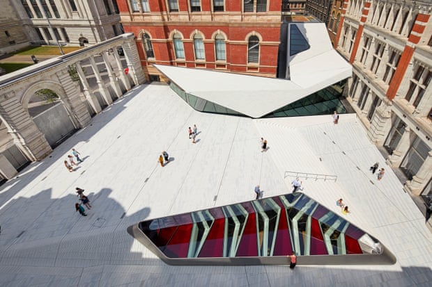
The Occulus @ V&A Photo: Guardian

The article goes on to claim that curators are conventional and terrified of daylight and thus have used black out blinds to block out the scary sunlight since opening.  Levette’s team had calculated that the light would fall down eighteen every hour of every day in every year . Yep - you heard right. Every. Single. Minute of every single day light would be falling onto the collections. And naturally the article takes no counter argument or consideration to collections care into account, - there wouldn’t be an issue with daylight falling onto the collections for 18 hours a day – nothing would happen right?

The curators are far from cowards and should be highly commended for sticking to their point and pull down the blinds on such risks to their collections. Indeed, I'd say its a win for collections management everywhere to see a curator who is so clearly on-side with the conservation staff. 

But this battle is not one that the V&A face alone, having spent much time working on exhibitions I’ve heard all of the ‘innovative’ and ‘striking’ ways we should put our collections at risk for the sake of a creative display. It doesn’t matter how many times you pass on collections display guidelines, barrier lengths and glass thickness details designers and architects will still come back with some crazy way of putting their concept first and the museum collection last – in my time I’ve heard of smoke machines in galleries (nope) the all too common staking objects on top of one another (definitely not) and the enraging ‘does it really need a barrier?’ 

How do we overcome it and continue to ensure collections are put first?

Voice your concern – if something doesn’t make sense on a drawing or a design briefing, ask about it! Often designers will have examples of similar displays, ways of mitigate risk or quite simply some ingenious and sneaky way of displaying objects safely and securely.

Assess the risk – if you really think that the collection is at risk and the designers aren’t budging then do a collections risk assessment, outline the eventualities and how the collection can be affected – this can serve as a good midway point to the argument. If there’s too much of a risk can a facsimile be made?

Stick to your guns – Hold your own and don’t be bullied into stepping down, there is a certain amount of creative thinking that can be discussed in early design plans but if ultimately the object is at risk and documented then don’t let it happen. Speak to colleagues in other museums and see how similar projects but remember as collections carers the objects come first.

Put the challenge over to them - Designers are brought on to projects to bring their experience, expertise and problem solving skills. They also work for the museum, who is the client. Challenge them to come up with innovative solutions that work within the environmental conditions you require. The design process should always be a conversation! 

And  finally! 

 Remember the goal - All parties are working towards the same aim a great display and an increase in access to our wonderful collections! 


Monday, 18 May 2015

Homes for the Homeless: the experience of Victorian poverty

We have to be honest, we usually find ourselves at the Geffrye Museum only around Christmas time. And for this, we are ashamed. For on a recent visit on a sunny spring day, not only did we realise that the building and its gardens are glorious in the sunshine, but it's exhibitions and displays are fascinating all year round. On this particular trip we were there to see 'Homes for the Homeless: Seeking Shelter in Victorian London' exhibition because, well, you know how we feel about the Victorians. (We love them in case that wasn't clear). What we found was a thoughtful, beautiful designed, multi-faceted exhibition that brought home the realities of life in the nineteenth century city.

The Pinch of Poverty - Thomas Benjamin Kennington 1891
Why is it that we are so fascinated by the Victorians? I think there's something fascinating about being able to look back at history through the medium of photography- which seems so immediate and 'real'. I also think we recognise a lot of ourselves in them - their socialising, family life, businesses, travel, aspirations : the Victorians are really the birth of the modern age we are still living in. But for all of the exciting technical innovations and fabulous clothes, Victorian London was a place of poverty, illness, and a pre-welfare state which left most of the work of looking after the vulnerable to charity organisations.

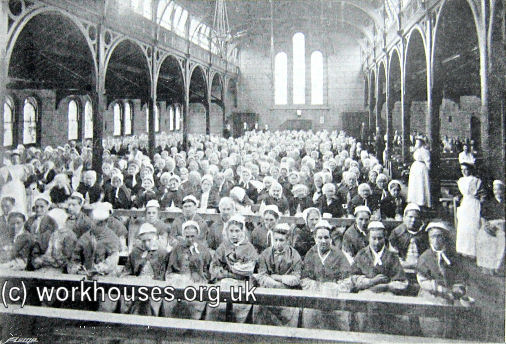
Meal-time at Holborn workhouse, 1885
We get pretty used to seeing images of Victorian families in slum conditions, dirty children playing in the street, or homeless people sleeping on benches. But we forget that for the homeless of nineteenth century London, they had to figure out everyday how to find a place to sleep and something to eat. How they achieved that shows the maze that was the Poor Law system (hospitals, workhouses), charity, and sometimes just sheer determination.

Corridor at a casual ward, early 20th c.
The Geffrye exhibition really aims to try and humanize all those black-and-white pictures of Victorian poverty that most of us have become desensitised to. Sure it's history, but those are really people's lives. Through recreated voice-recordings of contemporary testimonies, we hear about the experience of getting into a casual ward, living in a crowded common lodging house, or the best places to sleep rough. You can try the harrowing task of picking apart rope or sleeping in a coffin-like box bed. The displays show the savvy needed to navigate what relief was available, the conditions people endured, but also how people made the best of a bad situation.

Sleek, graphics-dense exhibition design
The messages of the exhibition are really hit home by a complimentary exhibition in the corridor in which vulnerable teens and children from the New Horizons Centre in Kings Cross. The participants reflect on their own experiences of homelessness, and see a surprising number of similarities with the situation as it was experienced over 100 years ago. With the new government possibly preparing to slash disability benefits, the Geffrye's exhibition takes on a new meaning as both a well-crated temporary display, and a meaningful warning for the future. 


 Homes for the Homeless is on at the Geffrye Museum until the 12th of July 


Saturday, 26 July 2014

The Ministry Recommends: Making Colour at the National Gallery

When looking for exhibitions to review, we often try to focus on London's smaller museums and galleries. Of late it seems institutions like the big nationals seem to being doing much of the same old same old. Thankfully we didn't let our preconceptions keep us from visiting the National Gallery's current exhibition Making Colour. We mean it when we say it is one of our favourite exhibitions of the year and an absolute curatorial masterclass of interpretation and design. Sleek, concise, intriguing and informative, Making Colour is exactly what an art exhibition should be.


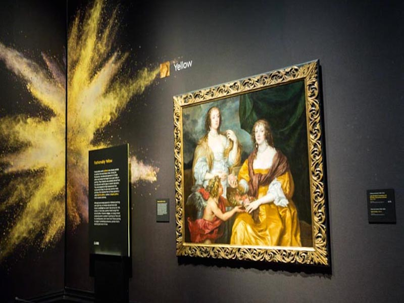
How do I even start reviewing this exhibition? It would be tempting to take you through room by room pointing out everything that was fascinating or noteworthy. But we'd be here all day. Making Colour is essentially a brilliant idea that makes you look at art differently. What more can you ask for? The rooms are organised by colour and structured by pigment. On one wall you'll see paintings from the 15th century through to the Impressionists who share in common the same pigments, usually displayed alongside the raw product. The concept is simple but eloquent. And the design follows suit.


Black painted walls provide a calm background for you to consider the nuanced colours of the painting. Each room is disrupted by a riot of colour that draws your attention to what you should be focusing on in that space, accompanied by concisely written panels that explore the origins of that pigment. The topic might be chemical is nature, but the emotional aspects of colour are not forgotten. Red for passion, love, rebellion and blood, purpose for luxury and royalty. 


Unlike some recent National Gallery exhibitions, there is plenty of space in the galleries and each painting is carefully chosen to prevent overcrowding. Perhaps most impressively, each room mixes works of art from across the centuries with raw materials, videos, sculpture and textiles. The mixed media enhances the paintings captures your attention. 


With your attention so carefully guided, each painting, which you probably wouldn't have strolled past without a second thought normally, becomes an opportunity for contemplation. In the gallery, visitors stare purposefully at each work- a testament to impeccable pacing and structured on the part of the curators. At a deeper level, each carefully considered artwork adds its own unique story to the message of the exhibition. For example, we learned how the red velvet arms of the dress worn by this sitter were likely made from dyes extracted from the textile of a similar dress.


This painting of the Virgin Mary takes on an additional devotional quality when we learn that the blue paint of her robes was worth more than gold. This artwork hangs next to a film which discusses the harsh reality of lapis lazuli mining in Afghanistan- showing how far we are still willing to go in our quest for the perfect blue.


It doesn't matter if you are a paintings enthusiast, a conservator, or just an art lover, we can guarantee you will walk aways from this exhibition having learned something new. Did you know that Isaac Newton developed the colour wheel in the 1660s? Or that Cezanne was only able to create his bright tropical landscapes because new synthetic paints had been developed? Or that some Dutch still life paintings contain poisonous lilies painted with ruby of arsenic? We are tempted to go back just to have another try and wrapping our mind around the idea of colour. 

Making Colour is on at the National Gallery until the 7th of September: http://www.nationalgallery.org.uk/whats-on/exhibitions/making-colour


Friday, 17 January 2014

Into the vaults at the Cheapside Hoard


Here at The Ministry we often visit exhibitions together yet rarely review them as one, but when it came to Museum of London’s latest blockbuster ‘Cheapside Hoard: London’s Lost Jewels’  we had too much to say for ourselves so why not reveal our critical personalities and combine our assessments into one post for the first time ever! 


Terri says... 

‘The mysteries that remain, lost among the cataclysmic events of the mid- 17th Century: who owned the Hoard, when and why was it hidden, and why was it never reclaimed’ – Museum of London.

What is so significant about the Cheapside Hoard? The mystery of why and who buried the collection of jewellery in the seventeenth century is a key theme of the hoard’s history and its current exhibition at the Museum of London. Who owned the hoard? Why was it hidden? And why did the owner never return to claim it? Opinion is varied yet one story predominates; in some sort of a hurry a jeweller buried his working collection containing rings, brooches, necklaces, gemstones expecting to return. Regardless of the jeweller's personal life and absence due to Elizabethan drama/death the hoard provides the most fantastic examples of 16th and 17th century craftsmanship and consumption.

Filled with Jacobean and Elizabethan treasures the simple wooden box of sparkling and shiny jewellery was unearthed at the City of London’s Cheapside in 1912.  Cheapside was considered the Hatton Gardens of its day, occupied by jewellers, markets, dealers the area even provided a site of pageantry for Elizabeth I the day before her coronation in 1599. Beneath the commercial hub of the City the hoard was left untouched for hundreds of years, until a high priced game of Finders Keepers when workmen evacuating a cellar unearthed the cache. The lucky sods soon sold all of their loot to ‘Stony Jack’ a notorious antiques dealer and ‘Inspector of Excavations’ for the London Museum, who then sold it majority to the London Museum, a few pieces to the British Museum and one chain to the V&A

The Museum of London’s exhibition ‘Cheapside Hoard: London’s lost jewels’ is the first time in since that sale in 1912 that the entirety of the hoard has been displayed together. The sheer amount of sparkle makes the show a ‘must see’ but what does it contents tell us?
Jacobean and Elizabethan London was a site of conspicuous consumption, with the birth of travel and overseas trade in the sixteenth century London was becoming a notorious site of consumerism – that has lasted until today. The rich were getting richer and a new middling merchant class was emerging. With this, the dramatic effect of status loomed heavy among those merchant classes and upper parts of society. A need to prove wealth and standing and what better way was there than to adorn oneself in jewellery. The more exotic to show travel and the larger quantity to show wealth equaled a theatrical need to express who you are by what you were consuming.

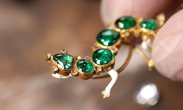
The Cheapside Hoard offers examples of some of my favourite conspicuous consumption habits of the period; ladies littering their dresses with rings and droplets of diamonds, pearls and any other gems – images we are familiar with in painting of the period but due to the nature of such ornaments little examples have survived. Beautiful enamel necklaces that hung down to the waists of males and females and exotic gemstones; amazonite from Brazil, rubies from India and perhaps most prolifically of all a watch made of Colombian Emerald. The watch not only shows the length and depth of travel and the need to consume but the craftsmanship of an unknown individual, the emerald would have had to have been the size of an apple to accommodate the watches movement. 


The sheer amount of examples is thrilling yet it is surprising to hear that the curator of the exhibition Hazel Forsyth believes that many of the treasures are still out there, Citing stories of ex- London Museum workers bringing back the odd ring or brooch as they leave the institution coupled with the 1912’s workmen’s fondness for a few drinks. Are there more treasures to be exhumed from the Cheapside Hoard?


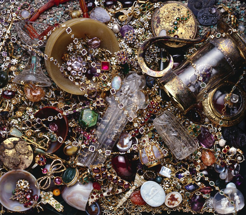
If only my jewellery box looked like this... 


Kristin says... 

With objects like these, you can be damn sure that Museum of London is expecting Cheapside Hoard to be its blockbuster exhibition of the year. And in true MoL style, the exhibition design matches the theme of ostentation. Entering the exhibition, you will be expected to leave all your belongings behind and pass through barred doors that make you feel like you are entering the Bank of England. Security procedure or exhibition design? Unclear, but the effect is amazing. It’s almost difficult to read the introductory text panel you are so distracted by a lighted sculpture of precious jewels hung from exposed wood beams. The beginning contextualising displays are, thankfully, blocked from the rest of the exhibition because if you knew what was coming next you would probably be spending considerably less time examining that painting. Around the corner is a reproduction jeweller's shop and once you make it past there, well, jewellery bonanza. 


The sheer scale of the hoard is brought together in one large room where you can circulate around the cases examining the minute details of each piece using your own spy-glass. On the one hand it brings an interactive element to an otherwise quite distant exhibition of expensive jewellery, but on the other hand it’s necessary as each item is so minute. Despite the very exciting subject matter, I don’t really envy the person who had to plan out a major exhibition based only on incredibly intricate 17th century jewellery. But with beautiful high resolution videos, complementary textiles and paintings and your trust magnifying glass, it all feels way more accessible.


 As it should be in an exhibition about the beauty of small things, it is the little touches that really makes the exhibition design a stand out. Contemporary shop signs actually hung at their proper height make a great change from the way such objects are normally displayed. What is really quite an average looking wooden carving seems ominous and somehow more real mounted above the rest of the displays. Someone on the exhibition team has even thought to push for tactile replicas which you can covet as you examine the real thing close up. Who said that an exhibition about jewellery had to be fiddly?

If we could fault the exhibition on any front it would be the video at the end. Why have they found it necessary to commission a dramatic video that expounds the secrets of the hoard and very tenuously tries to link it to modern life? We came for the shiny things, you gave us the shiny things, and we are pleased. 

The Cheapside Hoard: London’s Lost Jewels is at the Museum of London until the 27th of April.

);